Industry
Finance
Client
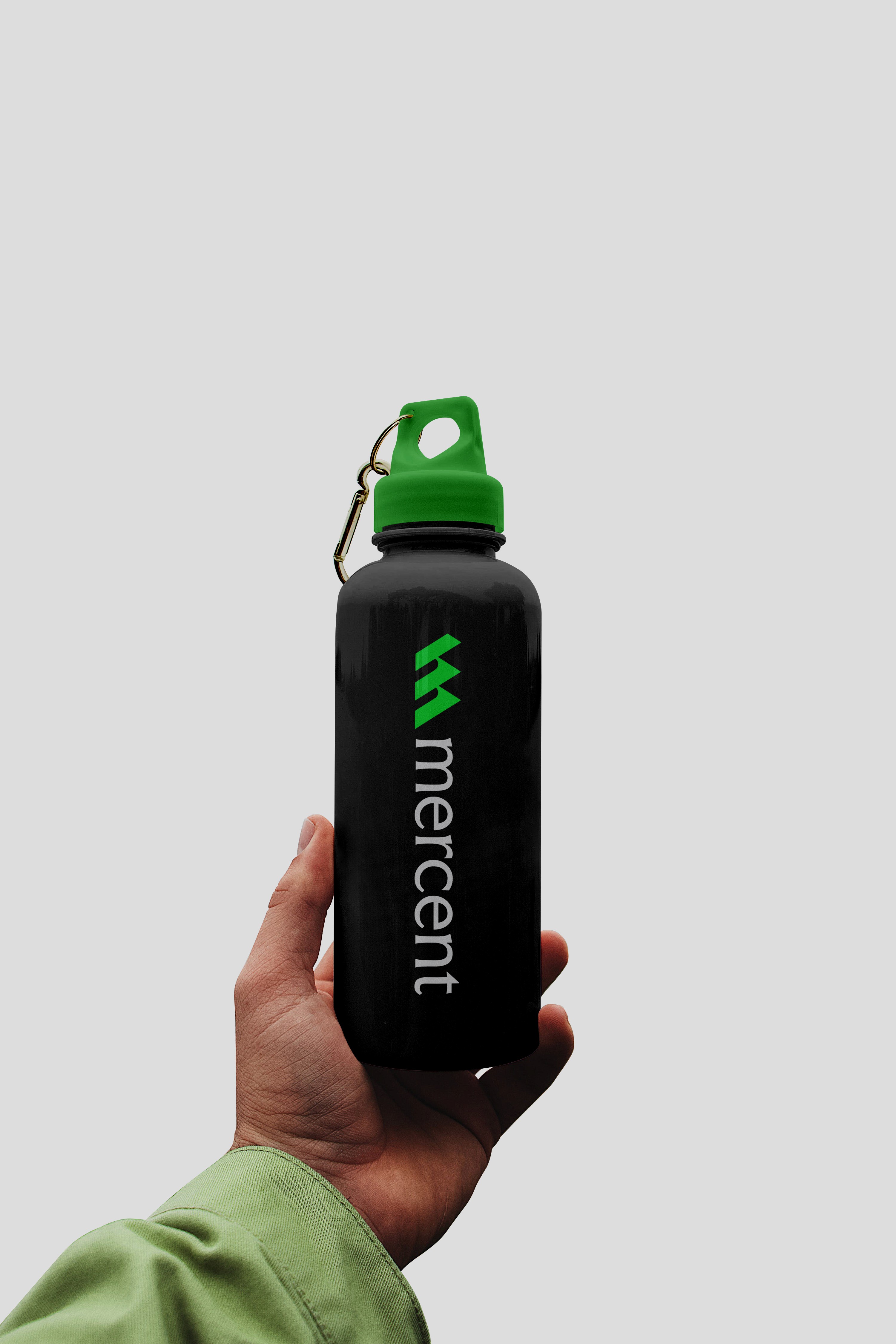
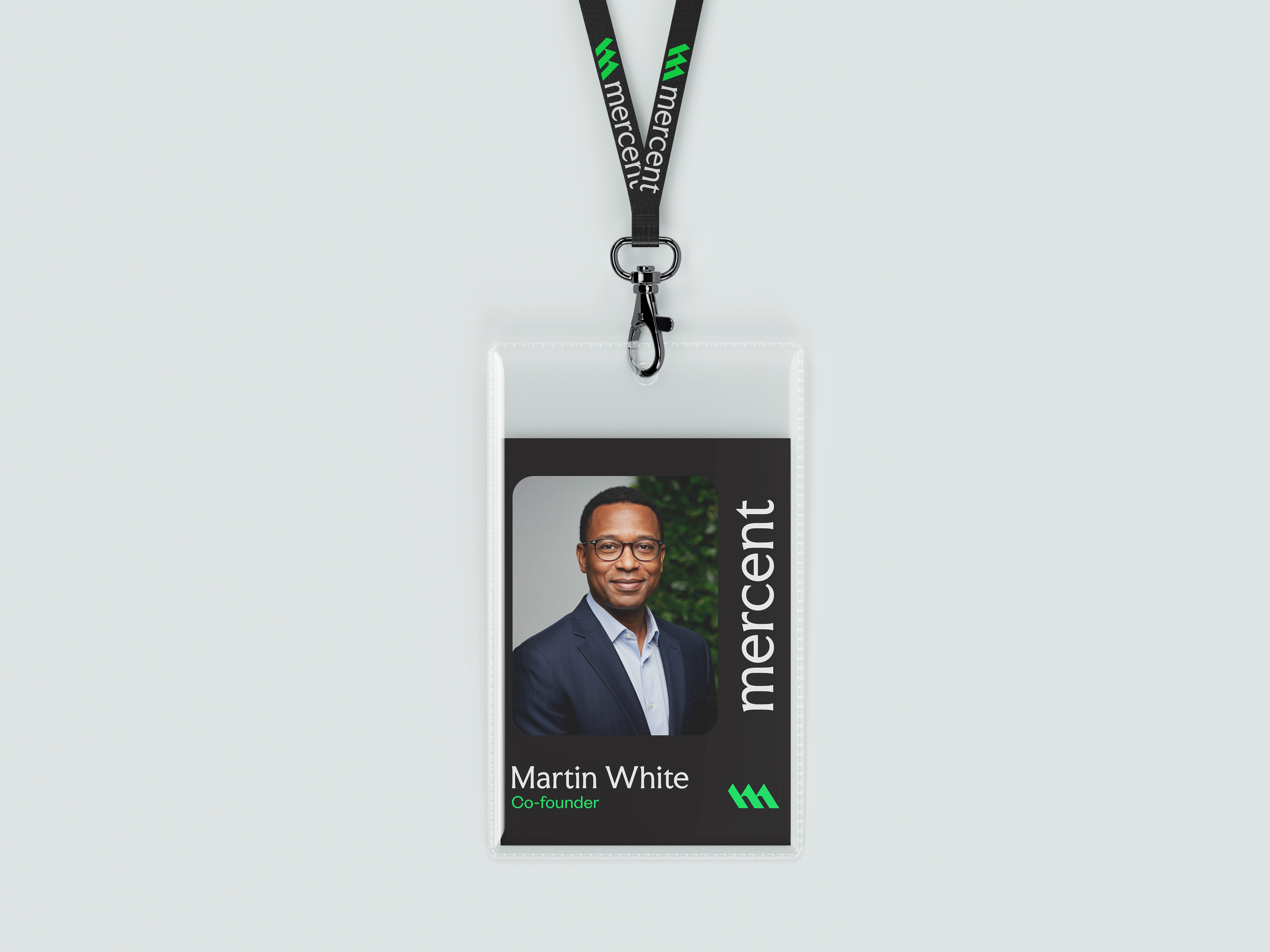
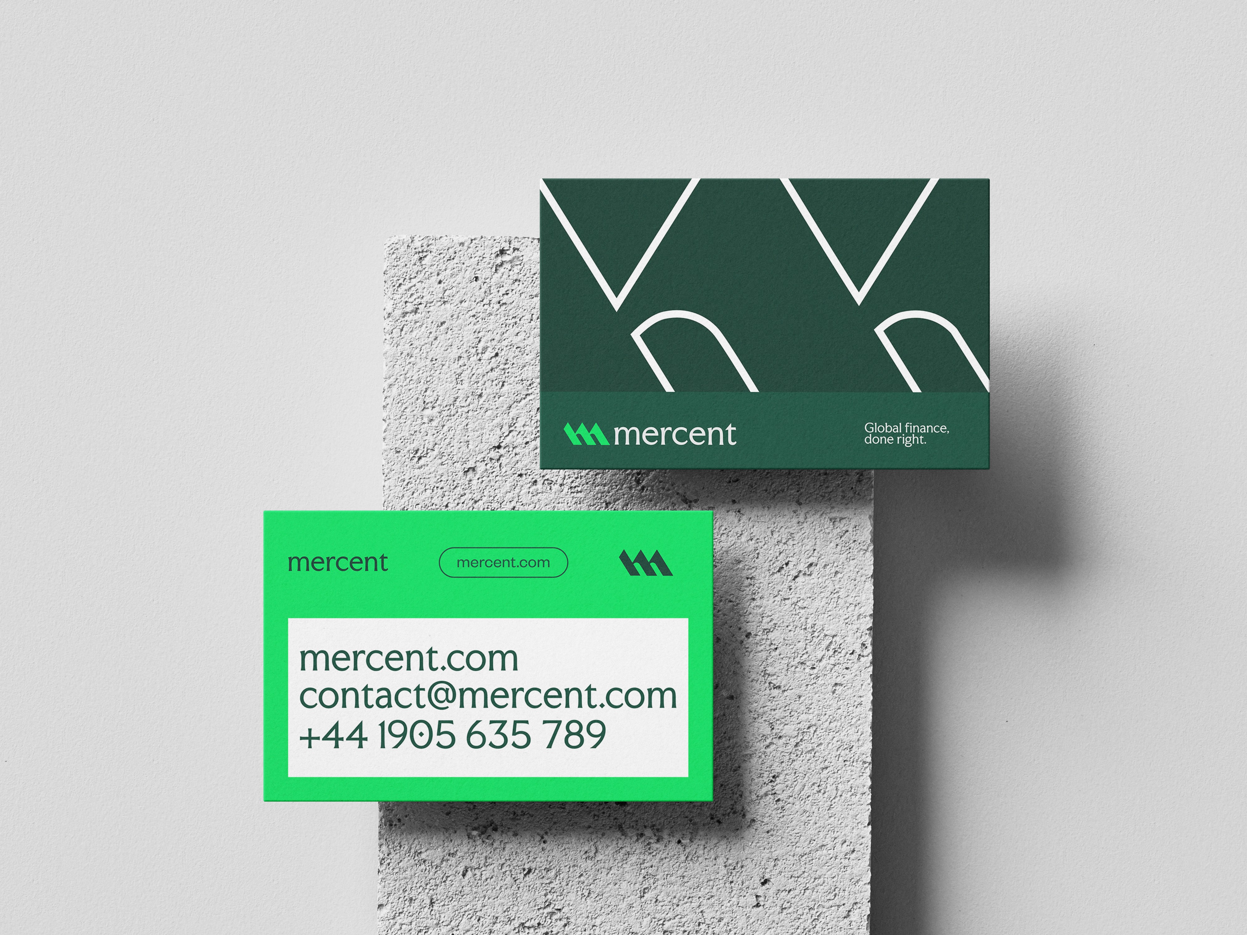
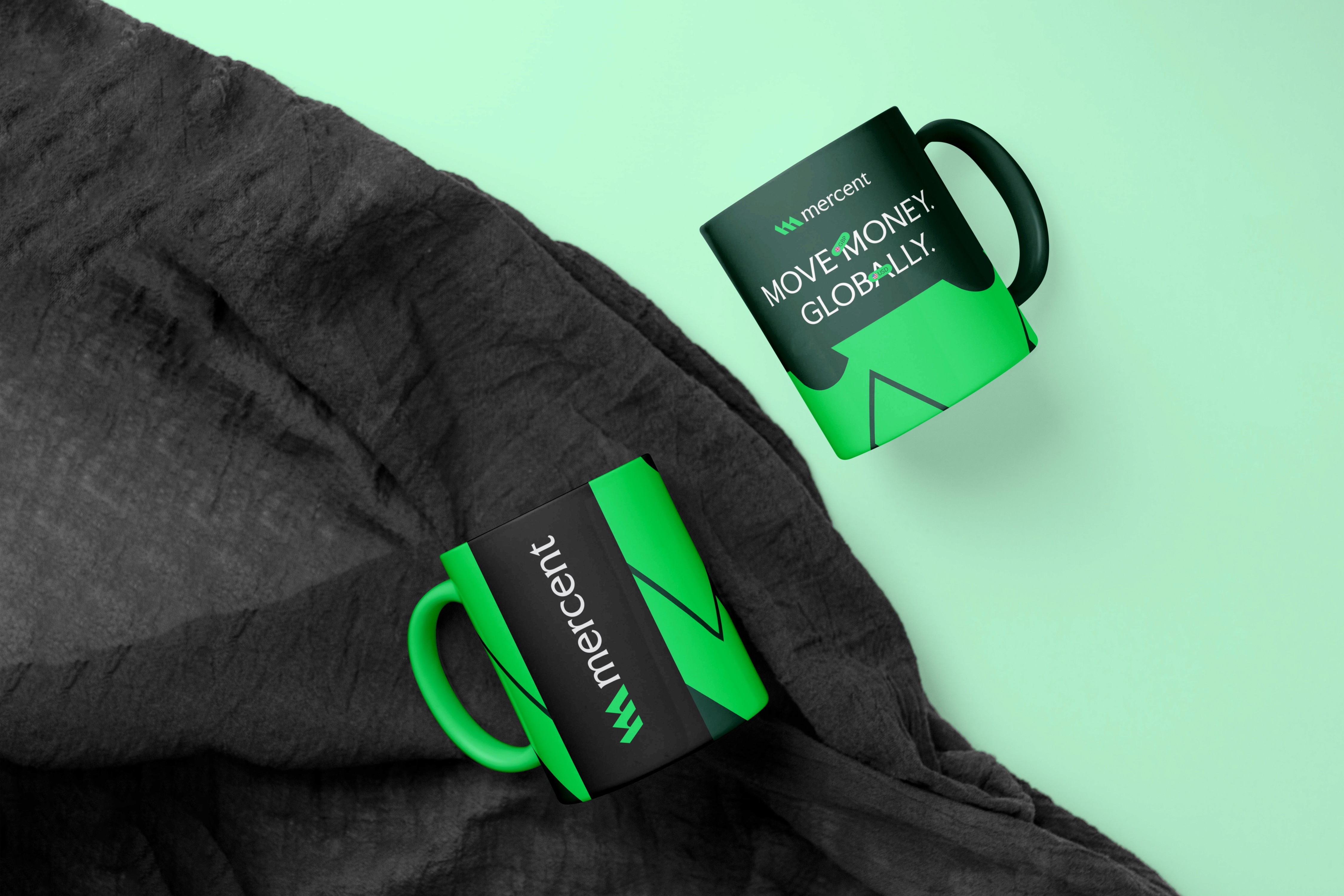
Mercent
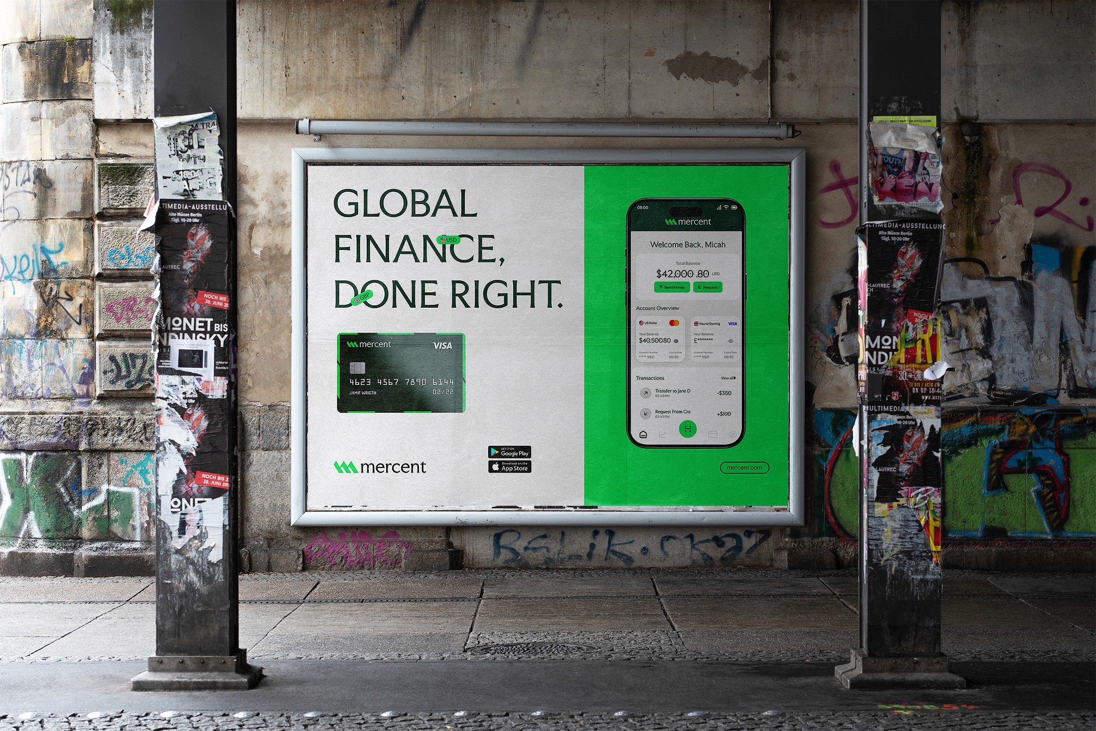
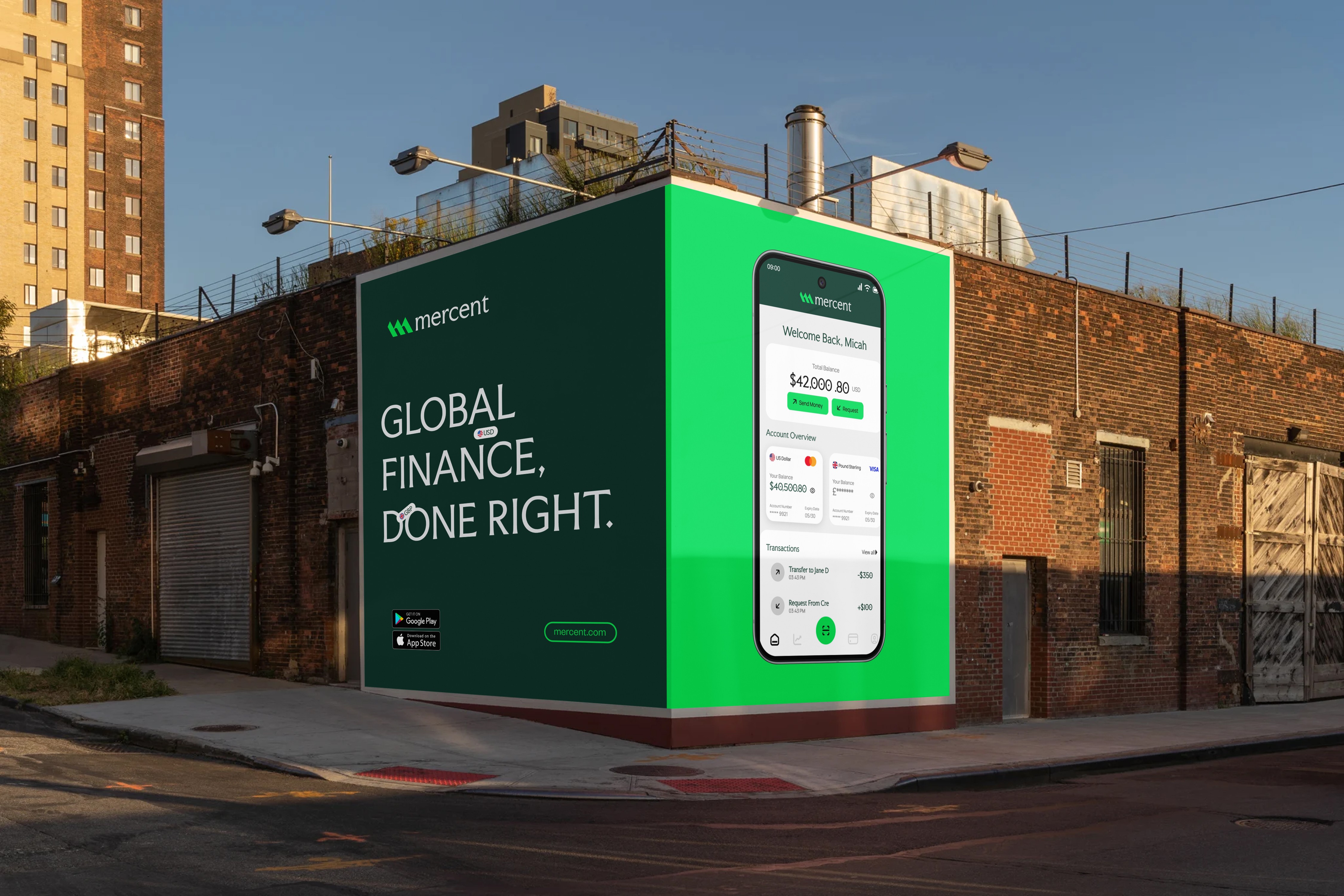
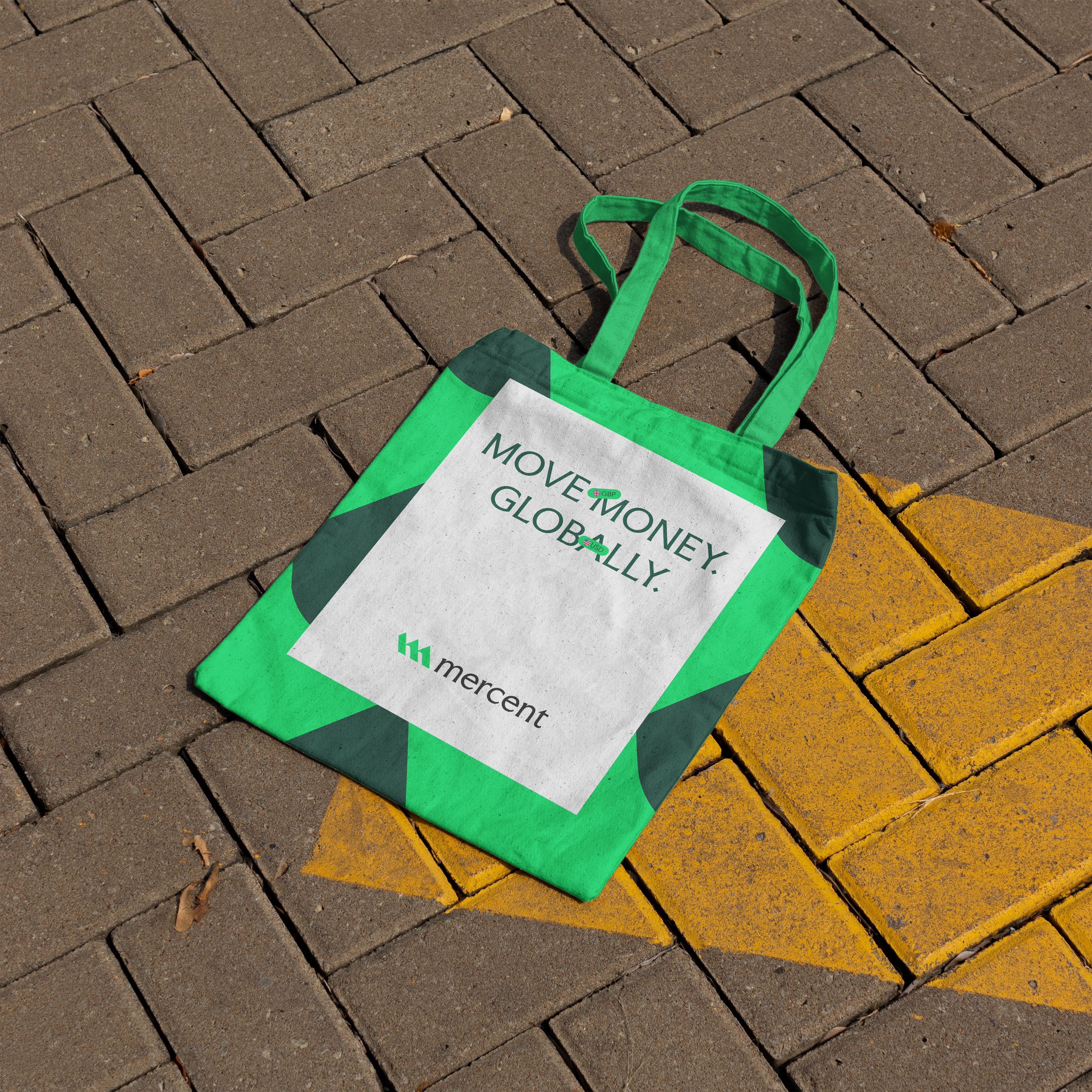
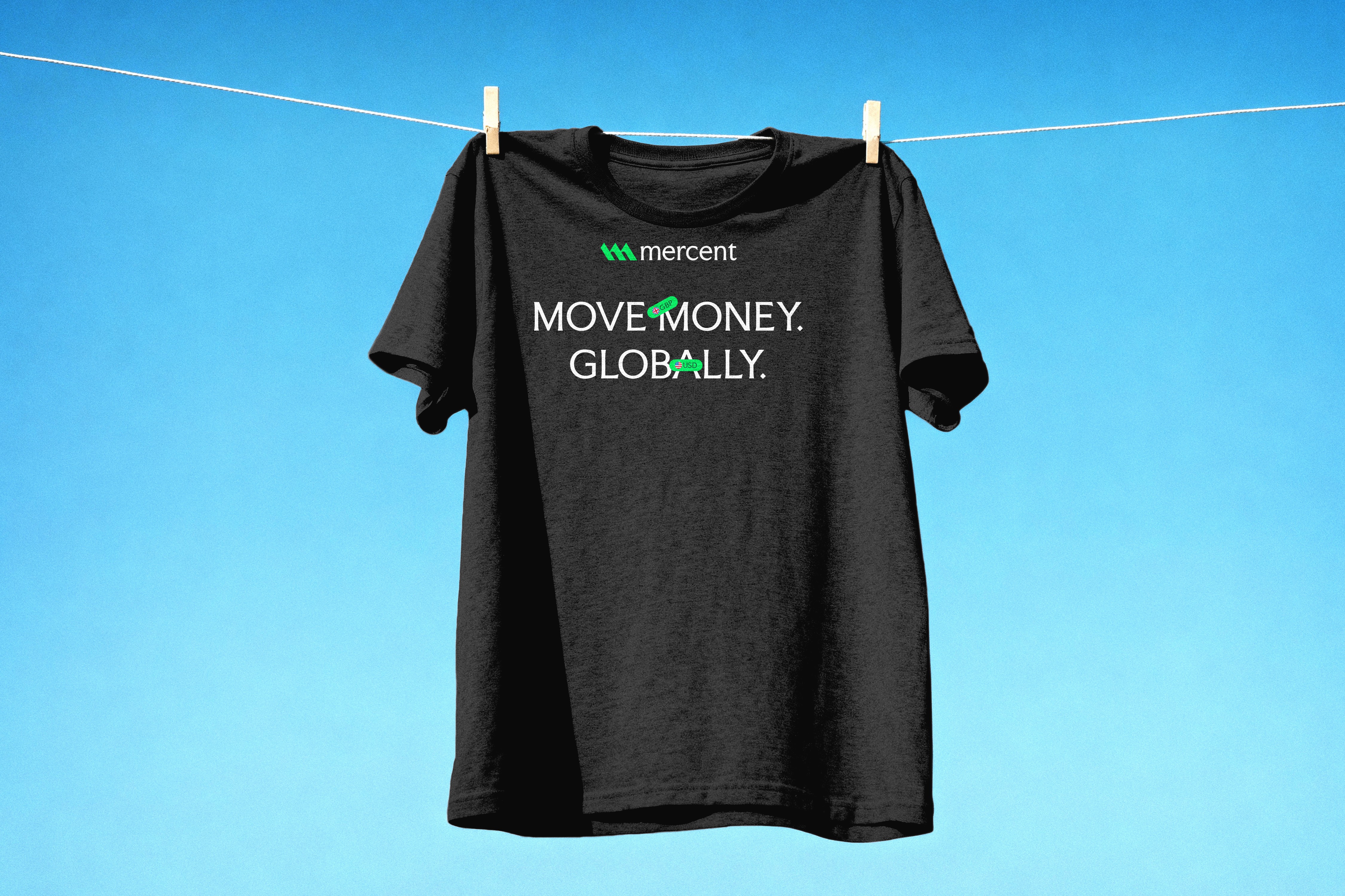
Global Finance, done right

Mercent is a corporate fintech brand built to simplify global finance while maintaining the authority and structure expected from a serious financial institution. In a space dominated by overly vibrant neobanks and loud fintech startups, Mercent takes a different approach. It communicates strength, clarity, and global competence.
The ambition behind the brand was clear from the beginning: create a financial identity that feels established, trustworthy, and internationally scalable. This was not about looking trendy. It was about building a system that could sit confidently alongside traditional banking institutions while still feeling modern and digitally fluent. The visual identity begins with the logo. The symbol is constructed from sharp, upward-moving geometric forms that subtly resemble growth indicators. The structure suggests momentum and expansion, reinforcing the idea of global financial progress. The mark feels stable and engineered rather than decorative, which aligns with the corporate positioning of the brand. It communicates reliability before a single word is read